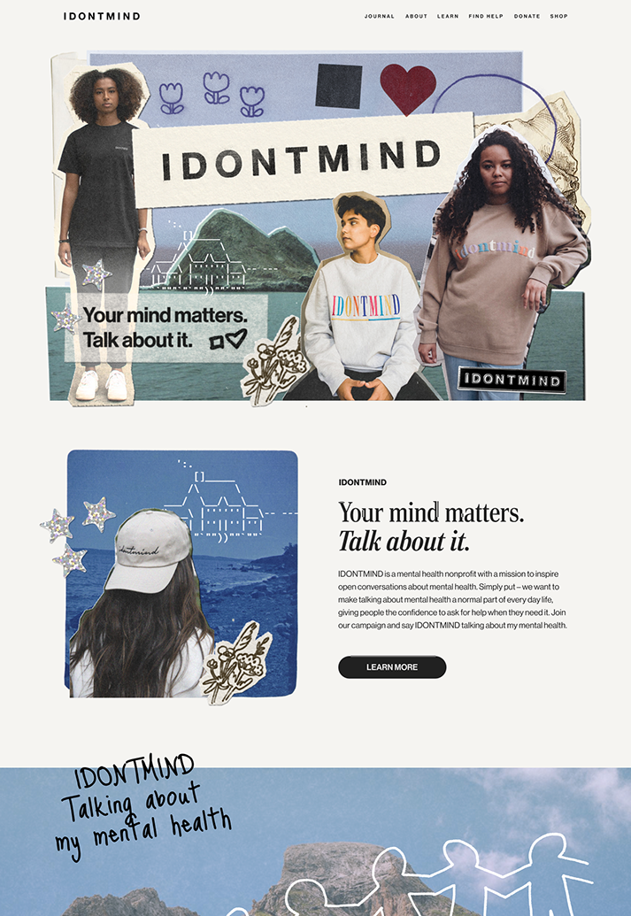
IDONTMIND is a mental health nonprofit dedicated to promoting open conversations about mental health and providing resources and support. I serve as IDONTMIND's Graphic Design and Creative Marketing Coordinator to shape the organization’s visual identity and support its growth in creative and digital media.


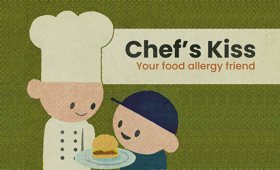
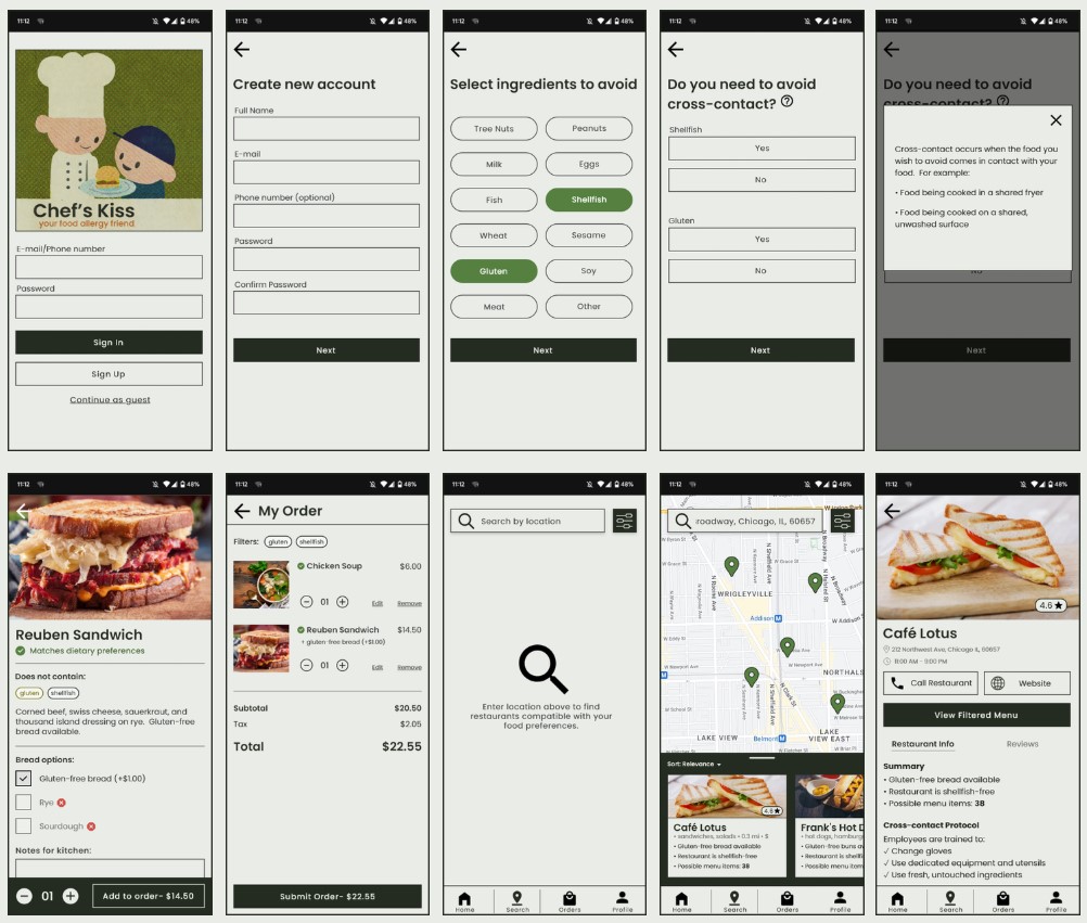
Input your dietary preferences and see exactly what options are available for you.


Communicate your needs clearly by specifying whether you need to avoid cross-contact.

Shared equipment is included when inputting a new menu item on the business-facing side of the app, helping to mitigate the risk of cross-contact from often-missed sources.
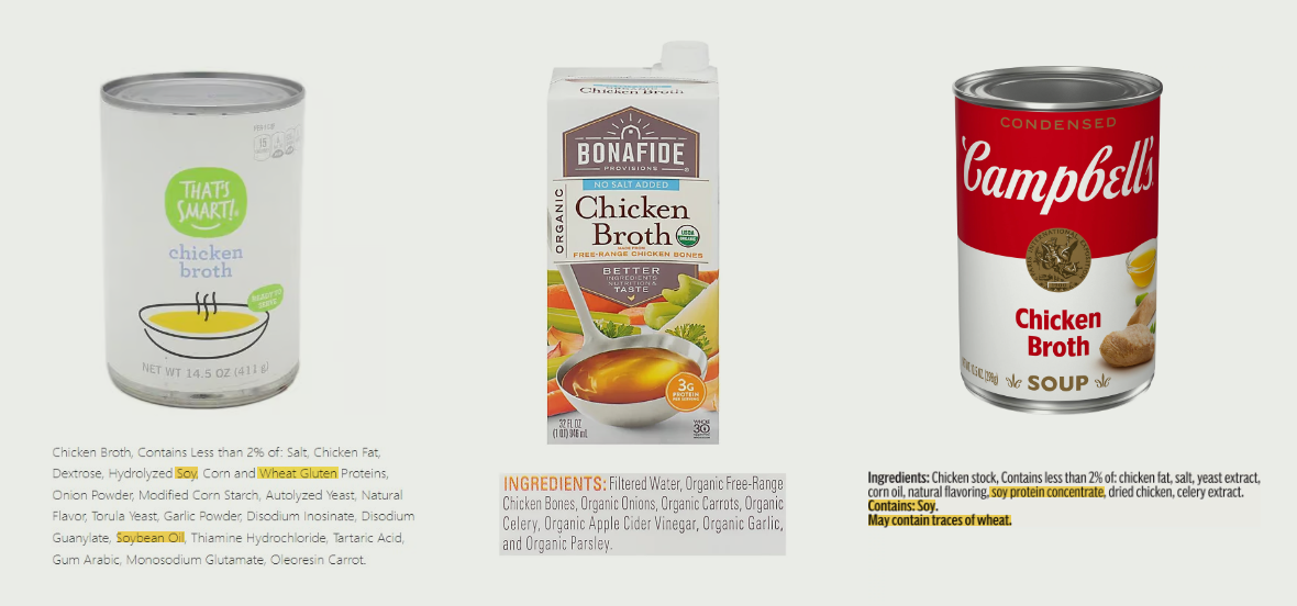
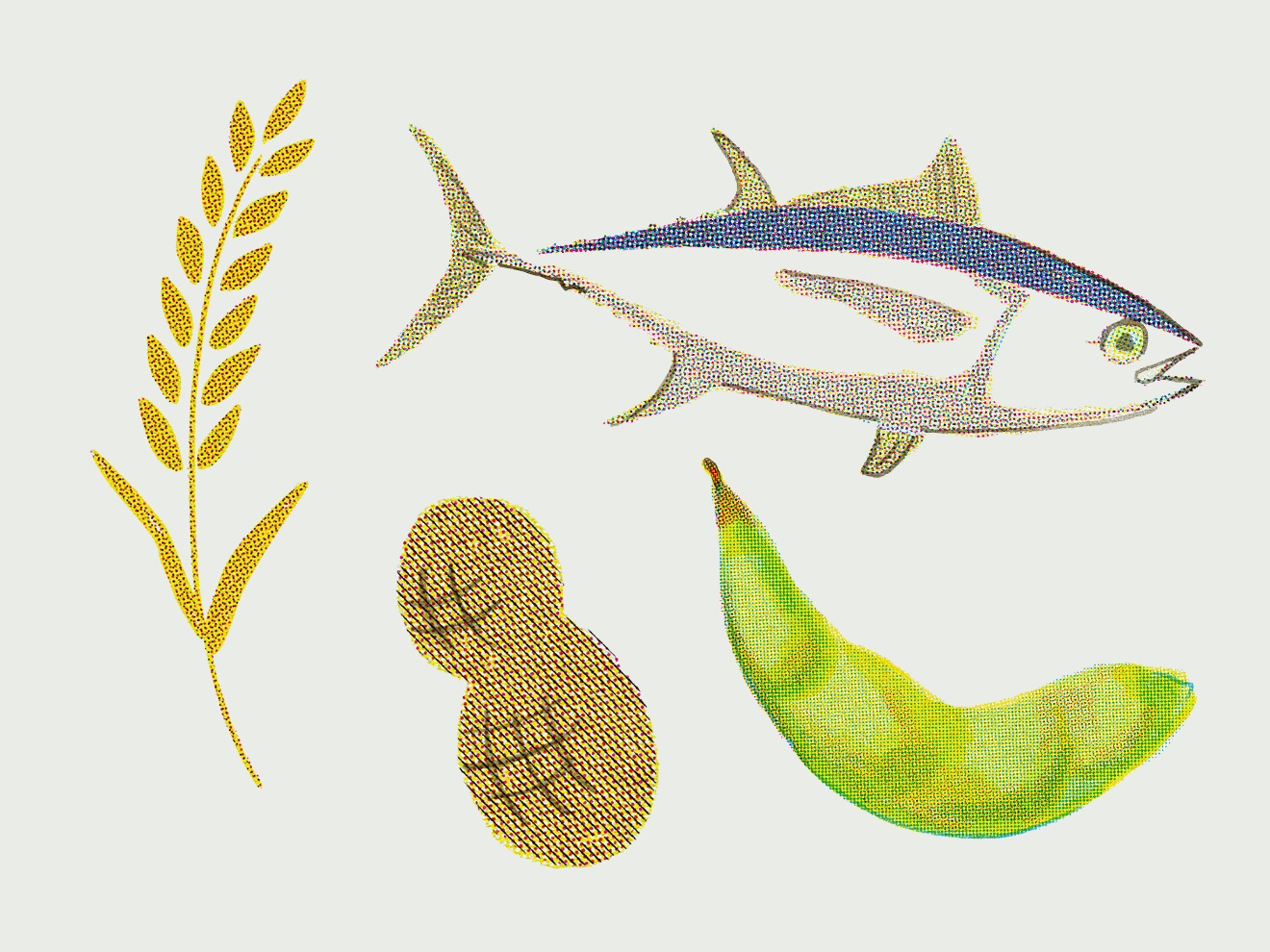
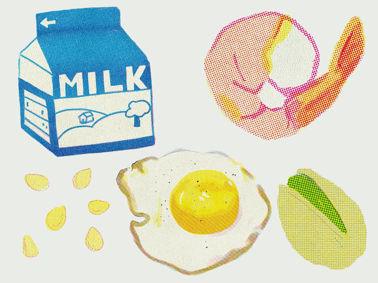
Allergens can hide in unexpected places. This is why it is important to be specific when building a menu item's ingredient list; different brands of the same ingredient often contain different allergens.
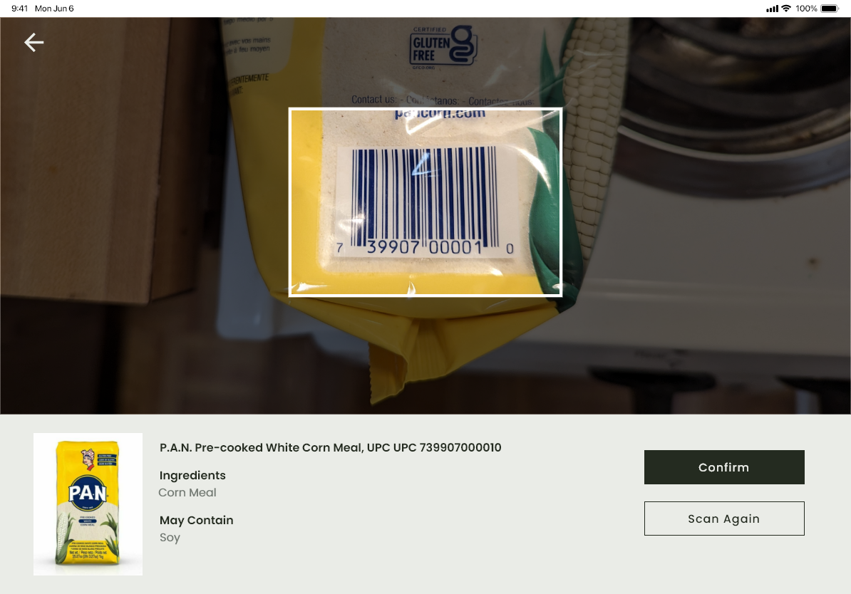
Chef's Kiss is designed with this in mind. Add specific products using the barcode scanner, search feature, or manual entry to ensure that every ingredient is accounted for.
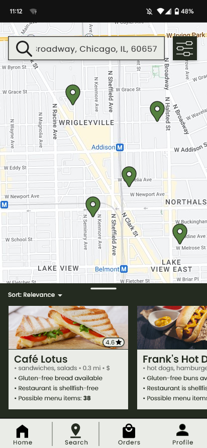
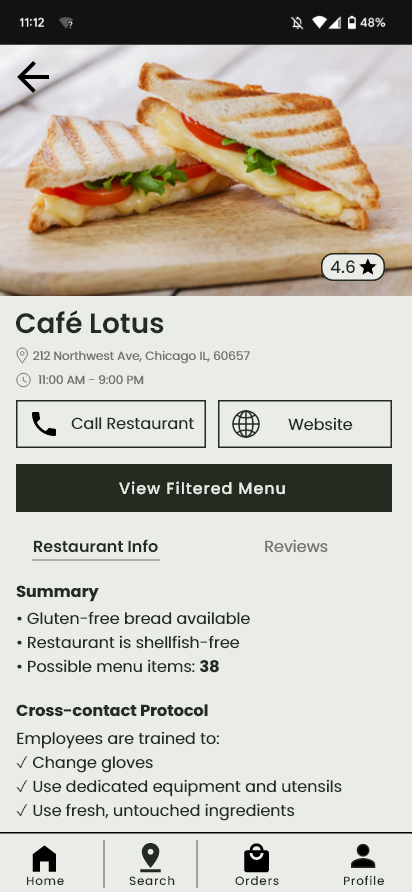
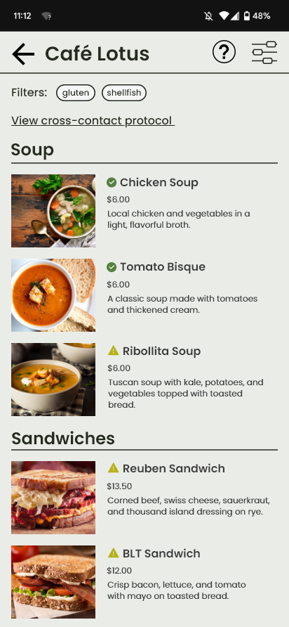
Input your dietary restrictions and location to find restaruants that can accomodate you. Quickly see the number of menu options that fit with your dietary preferences, kitchen cross-contact protocol, and more.
I wanted to get a better perspective on what things are like for restaurant staff when it comes to dealing with dietary restrictions, so I interviewed 6 restaurant workers about their experience with food allergies in the restaurant industry. Here are some highights:
"I think communication is kind of the biggest. Having all your servers be up-to-date on how to input the tickets, and training the cooks on how to read the tickets, what the allergens are."
"I think the big thing would be... having the allergies on the menu. Having that be updated."
"The biggest problem was our fryer. We only had a few fryers, and we were advertising a lot of things as being gluten-free when we were using the same oil for a lot of things."
"I would just say communication... the server has to be knowledgable of the menu to to be aware of whatever allergens the dish has, and comfortable enough to be able to ask us [the kitchen] for clarification."
In addition, I interviewed 4 people with food allergies about their experiences going out to eat.
"It's a lot of work. Even using apps like Find Me Gluten Free, you have to rely on other customer reviews, which aren't always up to date."
"The hardest part is having to rely on the server to be correct about what's safe. Most places don't have a good understanding of cross-contamination. "
In addition to my user interviews, I also researched competing products to analyze where they fall short.
Using what I learned from my research, I identified the main problems I wanted to solve and began brainstorming solutions. I tried to think about how the solution could serve both restaurant staff and customers with dietary restrictions.
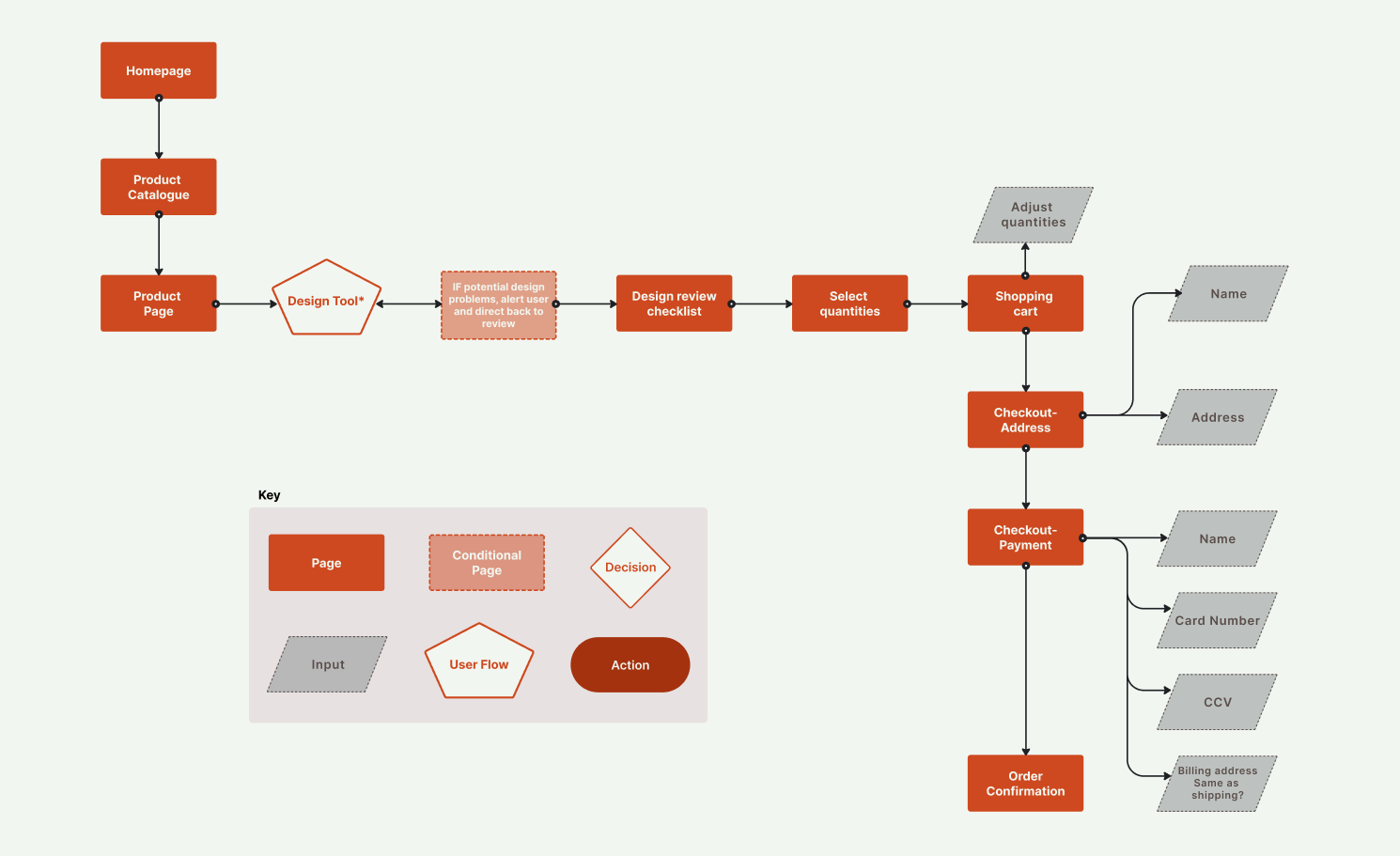
Since communication and lack of staff knowledge were such common problems, I wanted to figure out a way to minimize the need for these factors altogether. I decided at this point that I wanted to create a virtual menu that contained information about all ingredients and shared cooking equipment for each menu item.
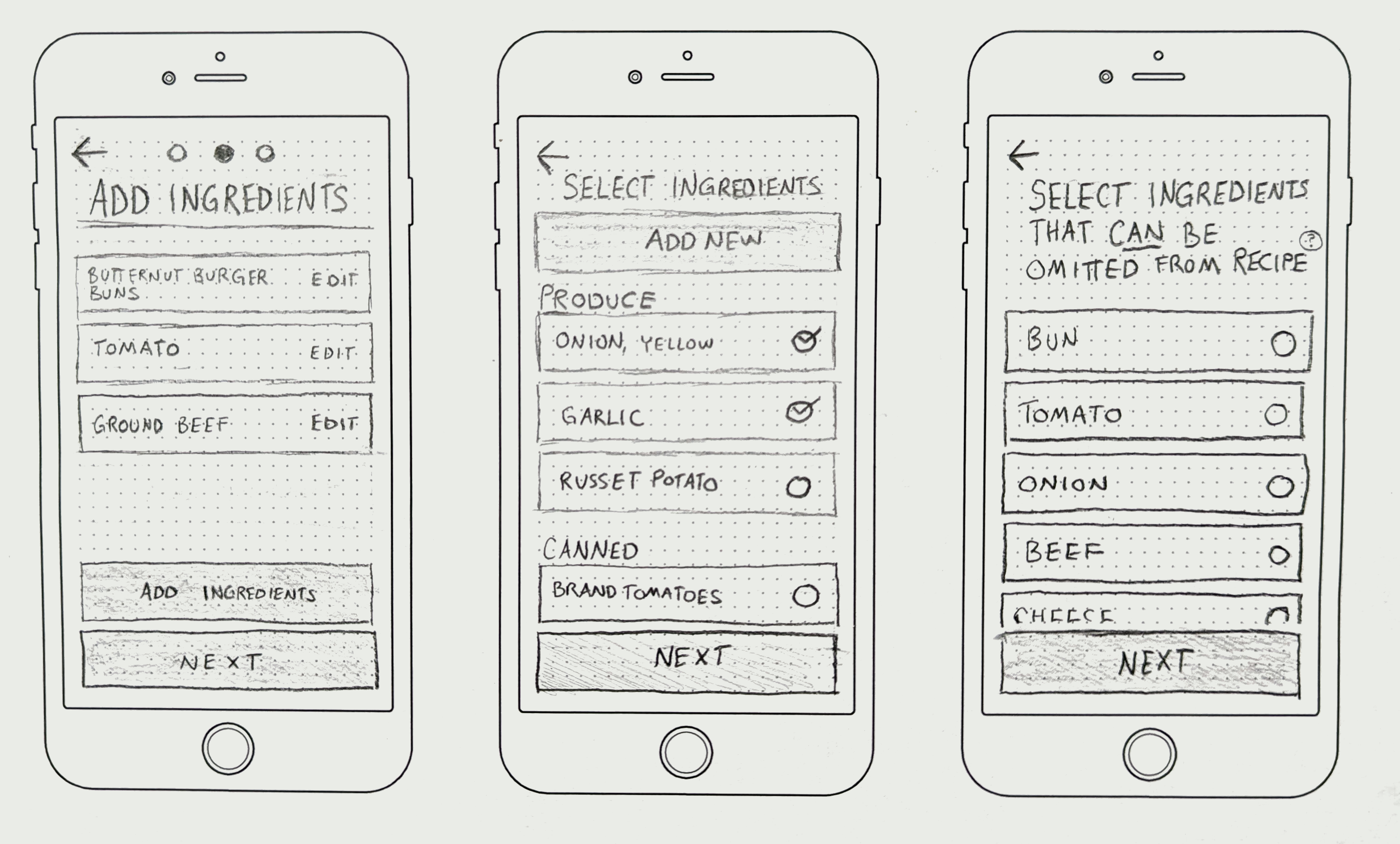
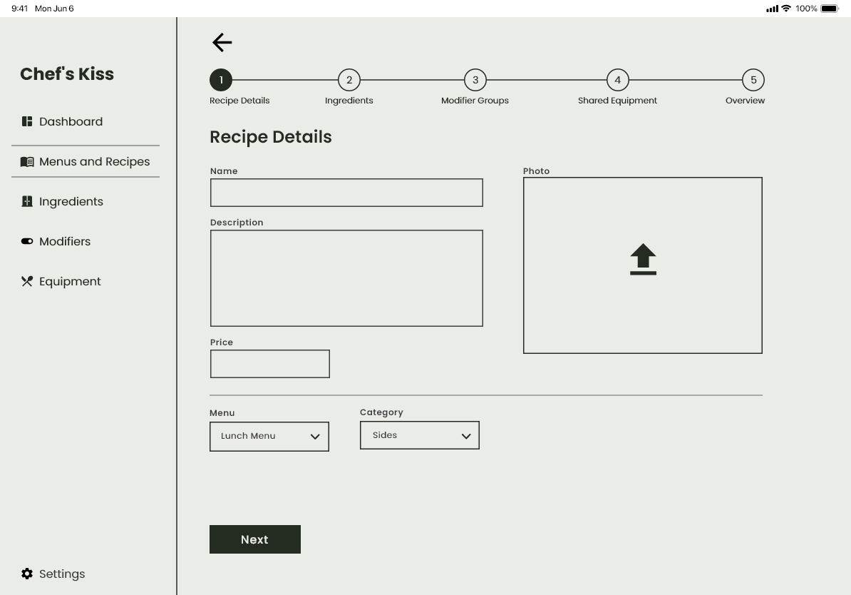
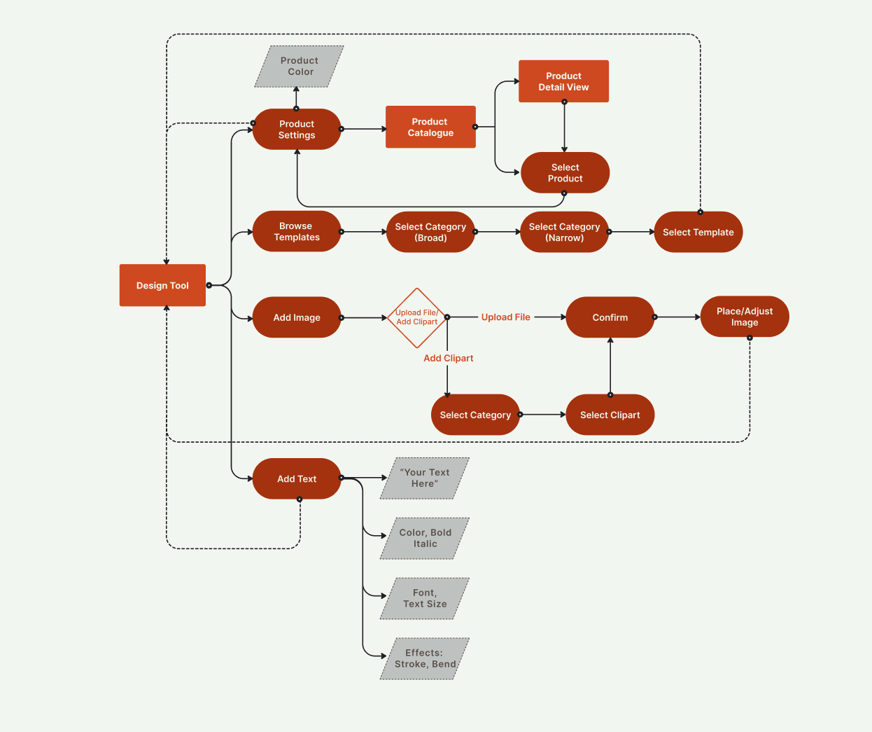
I created three different user flows (one pictured here) to map out the application's main functions. The flow below shows how a restaurant worker might go about adding a new recipe that contains new ingredients to the menu.

I sketched screens for both business-facing and customer-facing sides of the app, creating a screen to match each step of my user flows. I created an interactive prototype, which I tested with 3 users.
Initially, I had designed the business-facing side for smartphone (as seen in these sketches). I designed these screens for tablet in later iterations beause I felt that more space would make it easier to work with.
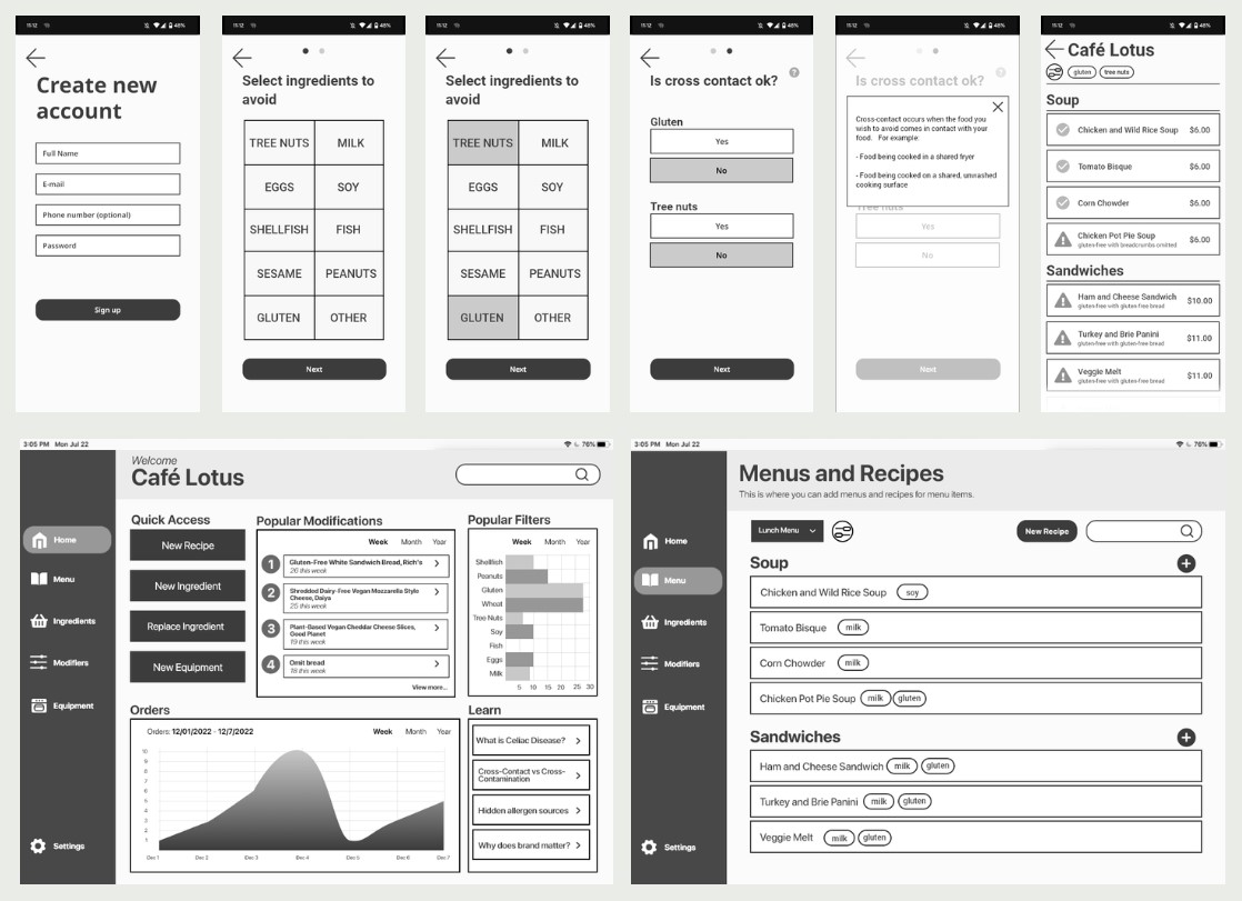
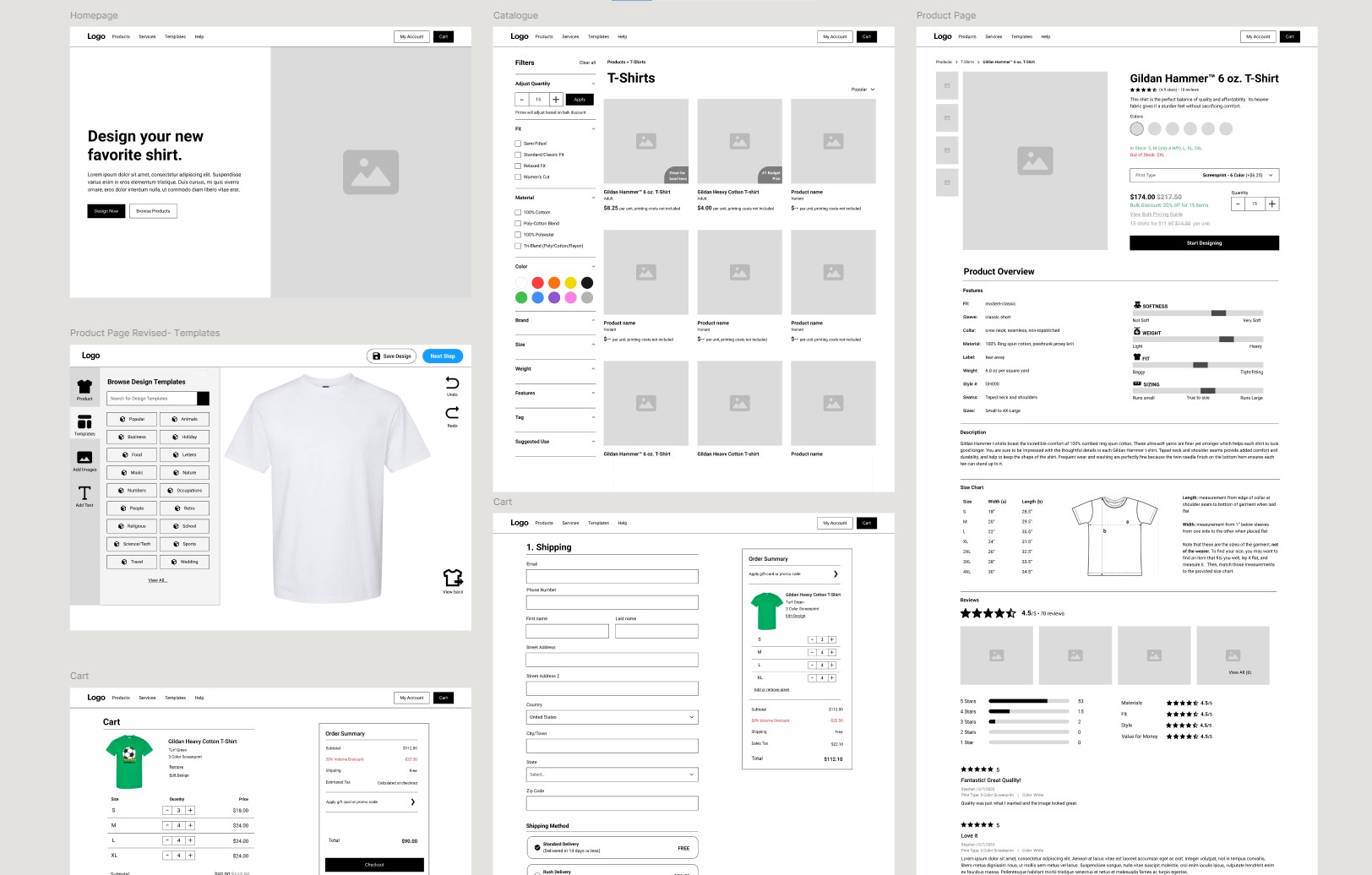
I made wireframe versions of my screens to further refine my design decisions. I designed the customer-facing side for smartphone and the business-facing side for tablet.
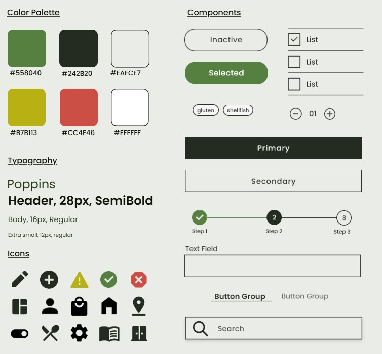
I wanted Chef's Kiss to feel trustworthy, familiar, and down to earth. I was inspired by retro, physically printed materials because I felt like they evoked a feeling of reliability and would probably feel familiar to a lot of users. I also created some risograph-inspired illustrations to add to the brand language.

Using my prototypes, I conducted 2 rounds of testing with a total of 10 users who either had dietary restrictions or restaurant experience.
I had each user complete 4 tasks using both the restaurant and consumer-facing sides of the app
Initially, I had the user taken straight to the menu from the dietary restriction selection page.
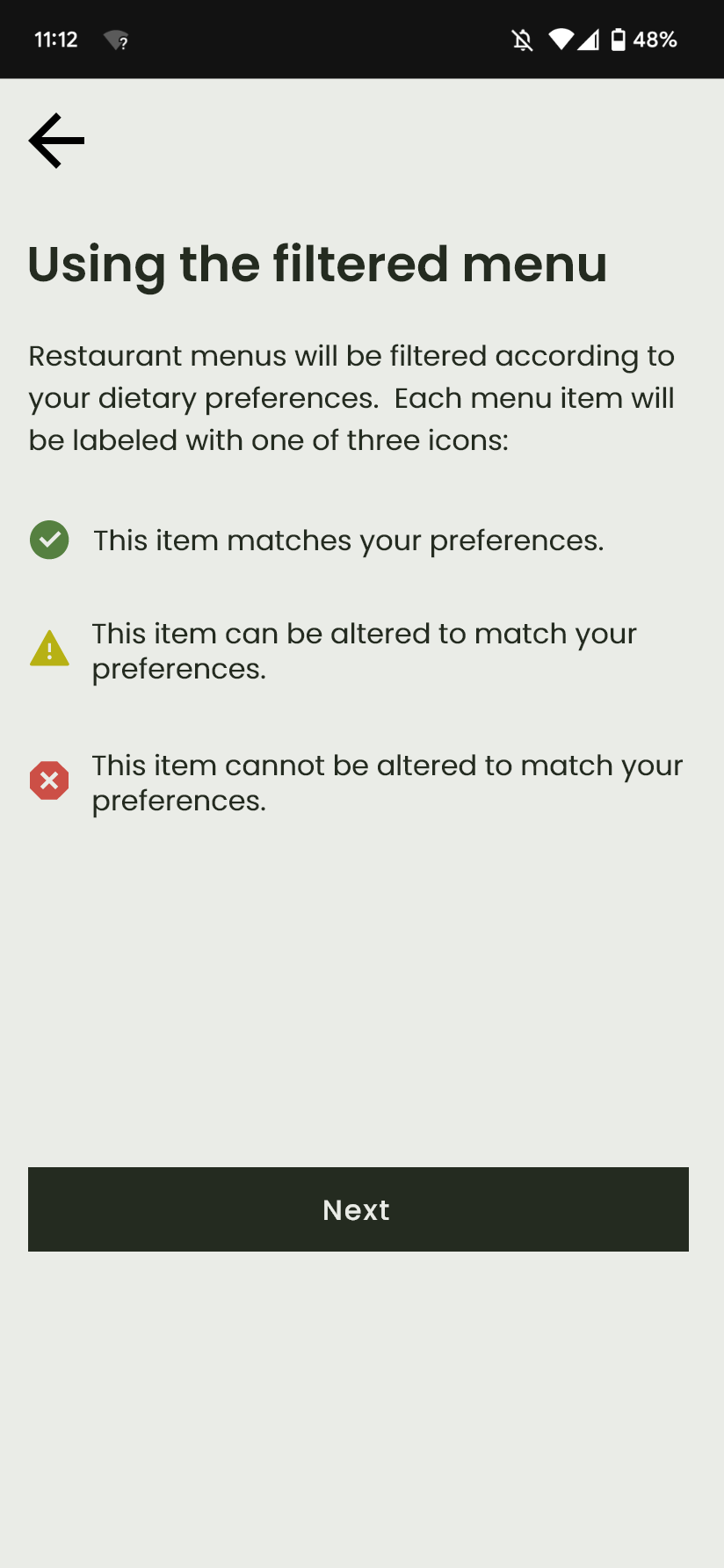
During the first round of testing, users were not entirely clear on what the icons on the menu meant.
When placing an order for a sandwich, some users wrote their allergies/dietary restrictions in the "Notes for kitchen" section; this was unnecessary, since the staff would be notified of these when the order was submitted anyway.
To address these problems, I added two informational screens in between the dietary preferences selection page and the menu.

Participants were given a recipe and asked to enter it. In the first round of testing, some users hesitated to move on to the next screen from this page. A few wondered if they should enter the recipe's ingredients in the "Description" section.
I added a stepper component to show users where they were in the recipe-adding process and to help them anticipate upcoming steps. In round 2 of testing, users showed no hesitation in moving through these steps.
It being my very first UX/UI product, I learned a lot, but the most important thing I learned from this project is the value of outside perspective. I wanted to be sure that my product was actually usable and helpful in a kitchen environment, and my interviews helped me understand how what I made could realistically fit into a restaurant setting and what problems existed that I could help address. Though user testing took time, I quickly discovered how easy it was for me to become blind to what seem, in retrospect, like obvious problems. Seeing users use my prototype was helpful not only for identifying problems, but also for giving me ideas for how to solve them.
I also learned how difficult it can be to design an interface with a very minimalist aesthetic! There's not much room to hide your mistakes, and each decision needs to be very intentional. It was a challenge, but it was helpful in sharpening my skills as a designer.
%202.png)
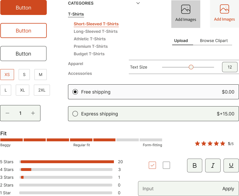
See suggested product uses to help make your decision, and understand how a product might fit and feel with easy-to-read scales.
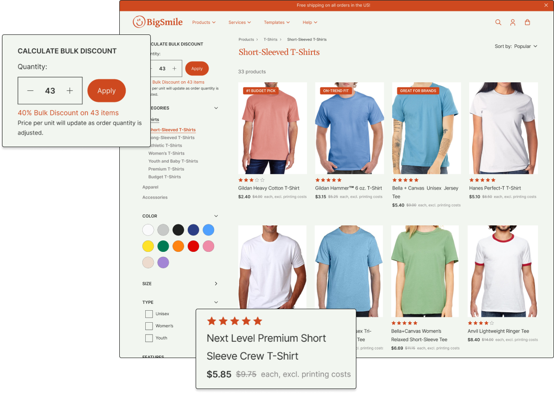
Easily compare product prices with bulk discounts applied. Item prices update as quantity is adjusted.
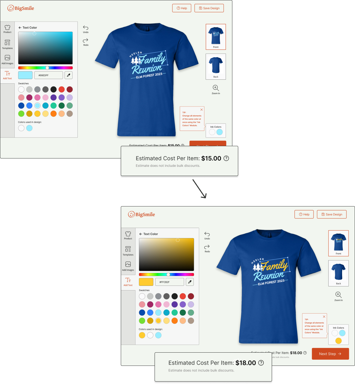
Keep an eye on costs in the design tool. When a new color is added, price is updated accordingly.
I put together a survey for users of print-on-demand apparel sites. I wanted to know how and why they used the service, what they prioritized when using these sites, and how satisfied they were with the final product. I was able to get responses from 18 participants. To view the insights from my user survey, click here.
I conducted a Heuristic Evaluation of three leading print-on-demand apparel sites: Spreadshirt, Rush order Tees, and Vistaprint. For each, I focused on how successfully they implemented the following usability heuristics:
I really appreciated how the article price and total were updated instantly as quantities were changed in Spreadshirt’s interface (right). This made it very easy to understand how the bulk discount played into pricing.
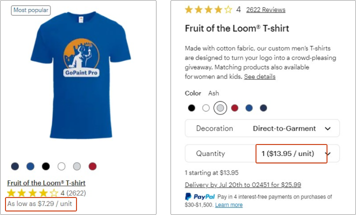
I felt that Vistaprint (below) was also lacking when it came to communicating its pricing. In the product search, products were listed at their absolute lowest possible cost, in this case “as low as $7.29/unit.”
On the product page for the same shirt, the price is listed at $13.95/unit. This might catch some users off guard if they are not familiar with the bulk pricing variability.

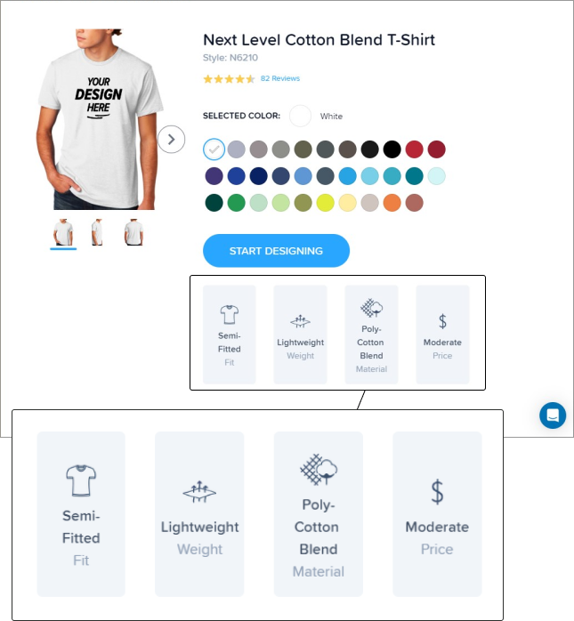
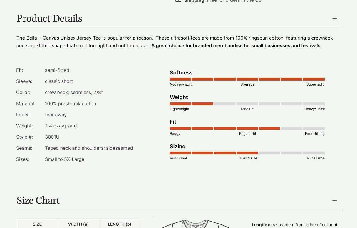
RushOrderTees had a graphic chart (right) to show fit, weight, material, and price for its products. All sites also included a product details listing (like the one shown below) with more technical details about the apparel.
I felt that the inclusion of this easy-to-read graphic was helpful for those who might not fully understand some of the terminology used in the list of product details (below).

Vistaprint had good measures for error prevention in its design interface. I uploaded a low-resolution image and was warned with a red bounding box, caution icon, and text alert immediately after it was uploaded (right).
Vistaprint also included a design review (below) that prompted users to check their design for legibility, spelling mistakes, and blurriness, which I felt was good both for preventing user error and for helping users feel more confident when placing their order.


I created user flows to plan out the most important functions of the site, including the process of selecting a product, using the design tool, and checkout.
I wanted the site to feel contemporary but welcoming to all kinds of users. I went with orange as the main brand color because I felt that it conveyed a sense of energetic creativity.
I created a prototype using Figma from my high-fidelity screens and tested it with three users over zoom. I gave each user a variety of tasks, divided into two parts.
One of the main features on the product page is this set of scales (right) that indicate the softness, weight, fit, and sizing for each item.
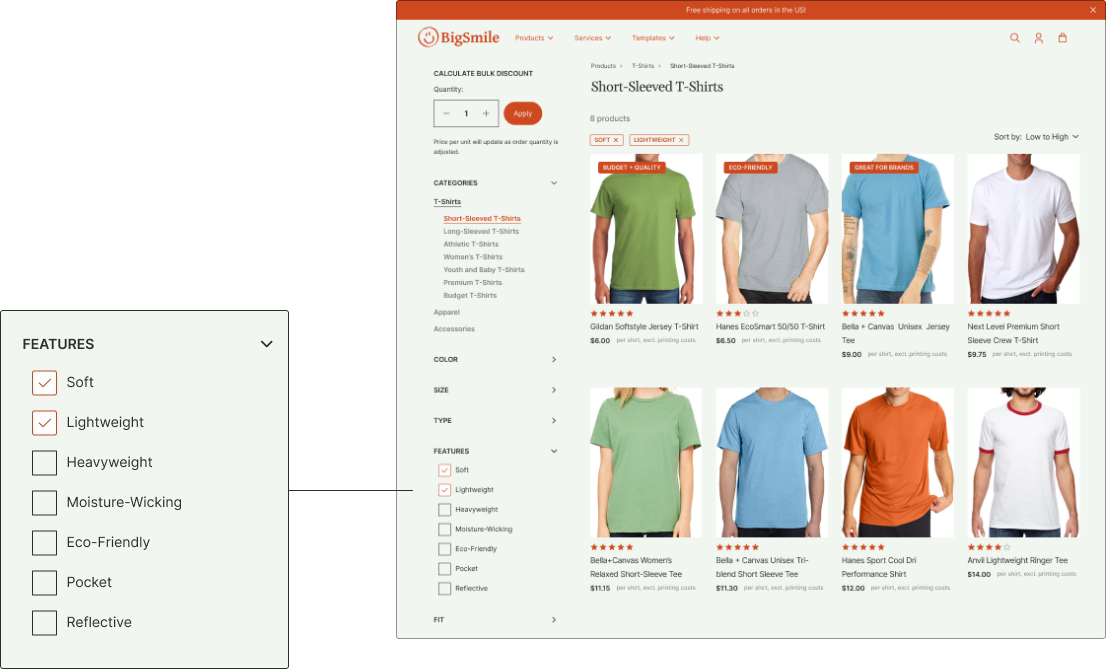
While all testers indicated that they found this scale helpful, a few pointed out that there was no way to filter products using these parameters on the product search page.
I added a new filter category called "features" on the search page (below) that includes these characteristics.
One participant said that they didn't realize that the cost per item increased with each ink color.
To ensure that user understood that additional colors would mean an increase in price, I created a pop-up that appears when users make changes that add new colors to a design.

Some testers said that they'd lik to see information in the reviews section about whether items run small, large, or true-to-size, so I adjusted the "fit" category to be more specitic.

I had never designed an e-commerce platform before, and I was surprised at just how many details there were to consider and how much there was to fit and organize on each page. Sometimes fitting all the needed information/components was a struggle, and I had to choose to prioritize functionality over style. It was a fun challenge to try to give the site a sense of personality and visual interest while also keeping it intuitive, familiar, and usable.
The design tool interface was quite a challenge too, and it required me to think creatively and strategically when building my prototype. I wanted user testing to feel as realistic as possible, so I had to build a lot of screens to make the steps feel natural while not building so many that it would throw off my limited timeline.
